Step 1
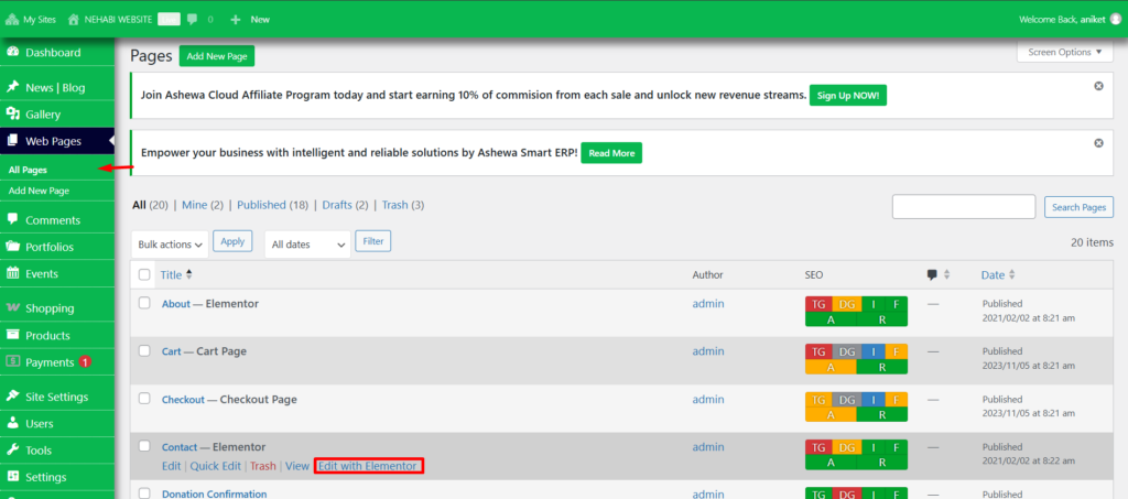
To edit your pages, use the Nehabi Page Editor (Elementor). Navigate to the Web Pages section, where you’ll find a list of all available pages. Hover over a page to reveal the “Edit with Elementor” option. Click it to open the editor, as shown in the image below.
Step 2
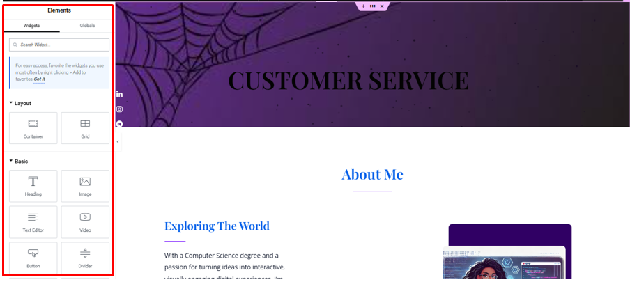
The red box in the image below highlights a sidebar labeled “Elements.” This section is likely part of a website-building platform or editor.
Widgets Tab:
- A search bar labeled “Search Widget…” allows the user to quickly find widgets for their design.
- A note suggests that frequently used widgets can be favorited for quicker access.
Categories of Widgets:
- Layout:
- Container: A widget used to create sections or group content.
- Grid: A widget for creating grid-based layouts for organizing content in rows and columns.
- Basic:
- Heading: A widget for adding headings or titles.
- Image: A widget to insert images into the design.
- Text Editor: A widget for adding and editing text content.
- Video: A widget to embed or display videos.
- Button: A widget for adding clickable buttons.
- Divider: A widget for adding horizontal lines or visual breaks between content sections.
This sidebar provides essential tools to structure and customize a webpage design. If you’re working with Nehabi or a similar platform, this is where you’d drag and drop elements to build or modify the page layout.
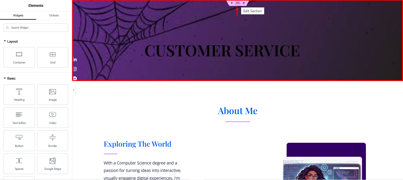
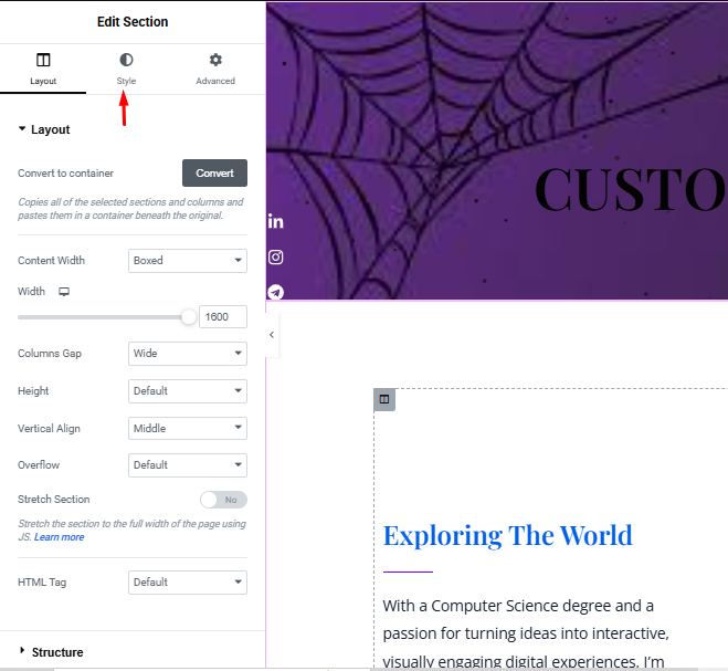
Step 3
To edit the elements displayed in the red box, “click” on the Edit Section button, as indicated by the red arrow above. Ensure that you select the middle dot within the section to access the editing options. This will allow you to customize or modify the layout and widgets to suit your specific needs effectively.
Step 4
Once you are in the editing section, navigate to the Style tab to access additional customization options. This section allows you to further refine and enhance the appearance of your selected elements.
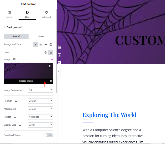
Step 5
To change the image, “click” on the area indicated by the red arrow. This will open your gallery, allowing you to select a new image to replace the current one.
Step 6
Once you are satisfied with your selection, “click” on the Select button to confirm and apply your chosen image.

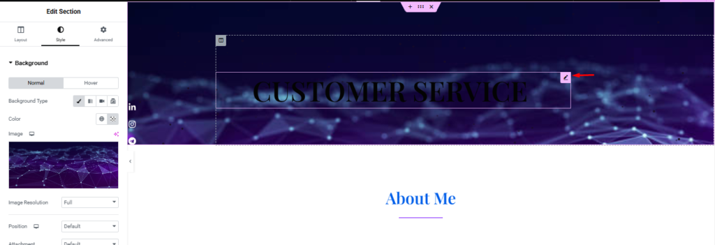
Step 7
To customize the heading, “click” on the pencil icon indicated by the red arrow in the image below. This will open the header editing options, allowing you to make the desired changes.
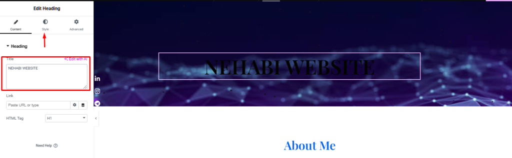
Step 8
Once you are in the heading editing section, you can update the text by typing into the Title Box, highlighted in the red box. After making your changes, navigate to the Style tab to further customize the appearance of the heading.
STEP 9
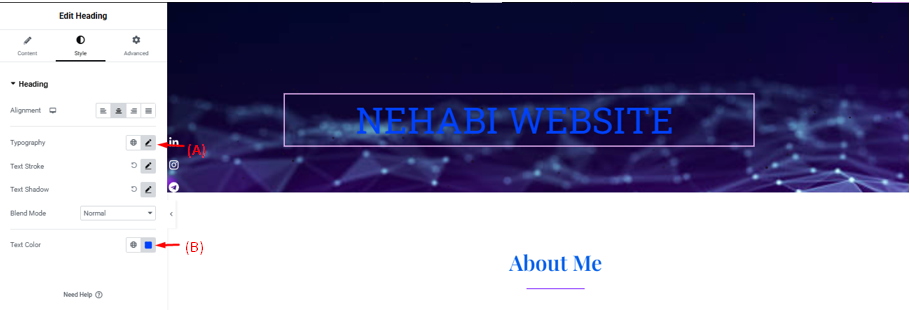
In Arrow (A), you can adjust the Typography of the text. This includes changing the font style, size, weight (boldness), line height, and letter spacing to achieve the desired appearance.

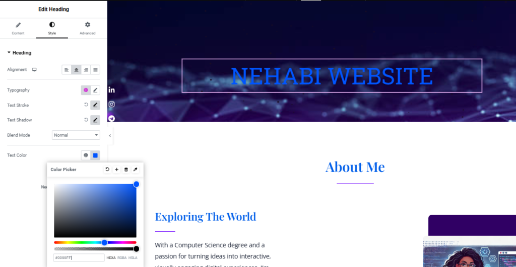
In Arrow (B), you can change the Text Color to match your design by selecting a color that fits your theme or branding.
Step 10
Once you are finished making your changes, don’t forget to click on the Publish button to save and apply your updates to the website. This ensures your changes are live and visible to your audience.